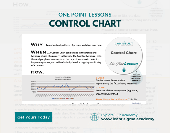
Control Charts
Stabilize your processes
Improve your Quality!
Quick Reference
Detect issues early
Make decisions based on data, not emotion
Reduce waste
Control Charts are visual tools used to monitor and maintain process stability and quality by tracking variation in a systematic way.
Description:
Control Charts, also known as Shewhart charts or process-behavior charts, are a fundamental tool in Statistical Process Control (SPC). They help organizations monitor processes and detect deviations from expected performance, enabling timely adjustments and ensuring consistent quality.
Components of a Control Chart:
Data Points: Measurements or observations collected from the process over time.
Center Line (CL): Represents the process mean or average. It's the reference point for tracking variation.
Upper Control Limit (UCL) and Lower Control Limit (LCL): These are boundary lines that define the acceptable range of variation. Typically, they are set based on historical data and process capability.
Steps:
Collect Data: Gather data points from the process over time. The data can be measurements, counts, or observations.
Calculate Control Limits: Determine the UCL and LCL based on historical data or process capability studies. These limits represent acceptable variation.
Plot Data: Create a control chart by plotting the data points on the chart over time, with time on the x-axis and the measurement on the y-axis.
Add Center Line: Draw a center line (CL) representing the process mean or average.
Monitor Variation: Continuously update the control chart as new data points become available. Look for patterns, trends, or data points that fall outside the control limits.
Interpret Results: Points within the control limits suggest the process is stable and predictable. Points outside the control limits indicate special causes of variation that require investigation and correction.
Take Action: When points fall outside the control limits or show significant patterns, investigate the causes and take corrective action to bring the process back to a stable state.
Benefits:
Early detection of process issues
Improved process stability
Data-driven decision-making
Enhanced product or service quality
Key Takeaway:
Control Charts are essential tools in SPC for monitoring processes and ensuring they remain stable and within acceptable variation.
By systematically tracking data over time, organizations can take timely actions to maintain quality and efficiency.
0 Reviews
Riaan is a dynamic leader, coach, facilitator, Lean Six Sigma Master Black Belt with over 20 years of hands-on experience driving business results. Riaan is highly skilled and has worked across diverse industries internationally. With a degree in Chemical Engineering, Riaan started in the major breweries and bakeries in South Africa and was so dedicated to his work that he was often known to take his work home with him.