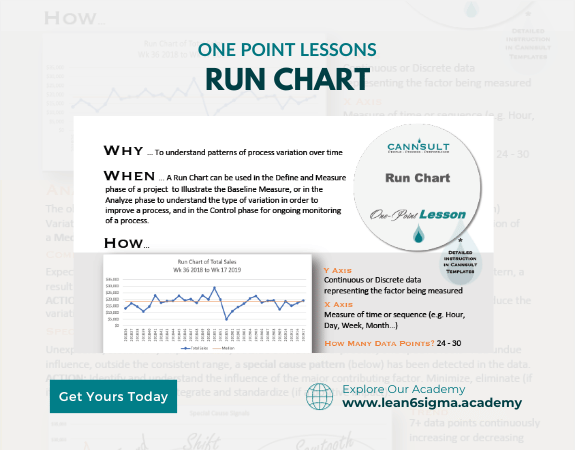
Run Chart
Detect problems early!
Understand your processes better!
Visual representation of Data
Use data to make decisions
Quick Reference on how to plot a Run Chart succesfully
A Run Chart is a simple yet effective tool for tracking and visualizing data trends over time, helping identify patterns and changes in a process.
Description:
A Run Chart is a graphical representation of data points plotted over time. It's a valuable tool for visualizing trends, patterns, and variations in data, making it easier to understand and improve processes.
Steps:
Collect Data: Gather data points over time. These can be measurements, counts, or observations related to a specific process or area of interest.
Arrange Data: Organize the data in chronological order, from the earliest to the most recent data points.
Create the Chart: Place time (e.g., dates, periods) on the x-axis (horizontal) and the corresponding data values on the y-axis (vertical). Plot each data point on the chart at the appropriate time.
Add Reference Line: Consider adding a reference line, such as a median or average, to help identify trends and deviations from the norm.
Analyze Data Trends: Examine the chart for patterns, shifts, or trends in the data over time. Look for periods of stability or variation.
Identify Special Causes: When a data point falls outside the typical range of variation, investigate the causes or events associated with it. These may indicate special causes of variation.
Continuous Monitoring: Update the Run Chart as new data becomes available. This allows for ongoing monitoring and trend identification.
Benefits:
Visual representation of data trends
Early identification of changes or patterns
Data-driven decision-making
Improved understanding of process behavior
Key Takeaway:
A Run Chart is a straightforward yet powerful tool for tracking data trends over time. It helps individuals and teams make informed decisions, identify patterns, and take action to improve processes and outcomes.
0 Reviews
Riaan is a dynamic leader, coach, facilitator, Lean Six Sigma Master Black Belt with over 20 years of hands-on experience driving business results. Riaan is highly skilled and has worked across diverse industries internationally. With a degree in Chemical Engineering, Riaan started in the major breweries and bakeries in South Africa and was so dedicated to his work that he was often known to take his work home with him.