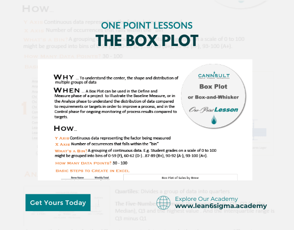
Box Plot
Visually display data correctly
Compare multiple data sets
Data analysis
Determine the spread and central tendencies
A Box Plot is a graphical representation of data that displays the distribution, central tendency, and spread of a dataset, making it useful for identifying outliers and comparing multiple datasets.
Description:
A Box Plot, also known as a box-and-whisker plot, is a visual tool for representing data distributions. It summarizes key statistics, including the median, quartiles, and potential outliers, providing a clear view of how data is spread and any unusual data points.
Components of a Box Plot:
Box: Represents the interquartile range (IQR), which encompasses the middle 50% of the data. The box is divided into two parts at the median.
Whiskers: Lines extending from the box indicate the range of the data, excluding potential outliers.
Outliers: Individual data points that fall significantly outside the whiskers and may indicate unusual values.
Steps:
Collect Data: Gather the dataset you want to analyze. This data can represent measurements, counts, or observations.
Sort Data: Arrange the data values in ascending order.
Calculate Quartiles: Determine the first quartile (Q1), which is the median of the lower half of the data. Determine the third quartile (Q3), which is the median of the upper half of the data.
Calculate Interquartile Range (IQR): Subtract Q1 from Q3 to find the IQR, representing the middle 50% of the data.
Identify Outliers: Define a range for potential outliers. Points falling outside this range are considered outliers.
Create the Box Plot: Draw a box from Q1 to Q3, with a line at the median (Q2).
Extend whiskers from the box to the minimum and maximum data points within the defined range.
Mark any outliers as individual data points.
Label Axes: Label the x-axis (horizontal) with a description of the data and the y-axis (vertical) with the data values.
Analyze the Plot: Examine the Box Plot to understand the distribution, central tendency (median), and spread (IQR). Identify any potential outliers.
Benefits:
Visual representation of data distribution
Identification of central tendency and spread
Detection of potential outliers
Comparison of multiple datasets
Key Takeaway:
A Box Plot is a powerful tool for visualizing and summarizing data distributions.
By examining the key components of the plot, you can quickly grasp the central tendency and spread of the data, as well as identify potential outliers.
0 Reviews
Riaan is a dynamic leader, coach, facilitator, Lean Six Sigma Master Black Belt with over 20 years of hands-on experience driving business results. Riaan is highly skilled and has worked across diverse industries internationally. With a degree in Chemical Engineering, Riaan started in the major breweries and bakeries in South Africa and was so dedicated to his work that he was often known to take his work home with him.