The Box Plot Template
Tell a story through good data
Visualize the data distribution
Box and whiskers
Display data with meaning
Understand the shape & spread of your information
Identify outliers
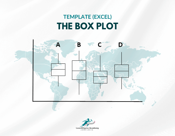
This Box Plot Template consists of the following components:
Box: The central part of the plot is a rectangular box, which represents the interquartile range (IQR) of the data. The top and bottom edges of the box correspond to the first quartile (Q1) and third quartile (Q3), respectively. The length of the box (Q3 - Q1) gives an indication of the spread or variability of the middle 50% of the data.
Line Inside the Box: A horizontal line inside the box represents the median (or the second quartile, Q2) of the data. It shows the midpoint of the dataset.
Whiskers: Two vertical lines, known as whiskers, extend from the edges of the box. The lower whisker extends to the minimum value within 1.5 times the IQR below Q1 (or the minimum value if there are no values below this limit). The upper whisker extends to the maximum value within 1.5 times the IQR above Q3 (or the maximum value if there are no values above this limit).
Outliers: Individual data points that fall outside the whiskers are considered potential outliers and are usually plotted individually as points. They are data points that significantly differ from the rest of the dataset and may warrant further investigation.
Title and Labels: The chart typically includes a title describing the dataset being plotted and labels for the X and Y axes to provide context.
Box plots are valuable for understanding the shape, spread, and central tendency of a dataset, as well as for identifying potential skewness, asymmetry, and outliers. They are especially useful when comparing multiple datasets or variables to make visual comparisons of their distributions. Here are some key insights that can be gained from a box plot:
The box's length and position of the median show the spread and central tendency of the data, respectively.
The whiskers' length indicates the potential range of typical values in the dataset.
Outliers are easily identified as data points outside the whiskers.
This Box Plot Template has been created using Microsoft Excel .
They are commonly used in data analysis, quality control, and exploratory data analysis to summarize and visualize data distributions.
0 Reviews
Riaan is a dynamic leader, coach, facilitator, Lean Six Sigma Master Black Belt with over 20 years of hands-on experience driving business results. Riaan is highly skilled and has worked across diverse industries internationally. With a degree in Chemical Engineering, Riaan started in the major breweries and bakeries in South Africa and was so dedicated to his work that he was often known to take his work home with him.