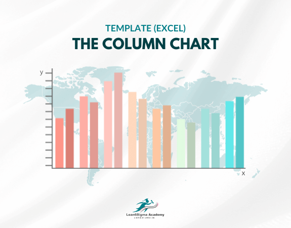
The Column Chart Template
Visual interpretation of data
Show trends
Display data over time
Compare quantities
Identify variations
The Column Chart Template typically includes the following components:
Vertical Columns: The central feature of the chart is a set of vertical bars, each representing a specific category, group, or variable. The height of each column is proportional to the value it represents.
Categories or Variables: The horizontal (X) axis of the chart displays the categories, variables, or labels associated with each column. It provides context for the data being presented.
Values or Counts: The vertical (Y) axis of the chart represents the values, counts, or measurements associated with each category or variable. It serves as a scale for interpreting the height of the columns.
Title: A title is typically included at the top of the chart to describe the dataset or the purpose of the chart.
Axis Labels: Labels are added to the X and Y axes to provide additional information and context. The X-axis labels correspond to the categories or variables, and the Y-axis labels indicate the scale of measurement.
Legend: If the chart includes multiple series or data sets, a legend may be added to differentiate between them and provide color or pattern associations.
Data Labels: Data labels can be added to the top of each column to display the exact values or percentages they represent, making it easier for readers to interpret the chart.
Column charts are commonly used for various purposes, including:
Comparing quantities or values among different categories or groups.
Showing trends and changes in data over time, especially in time-series data.
Identifying variations or disparities between data points.
Illustrating the distribution of data within categories.
This Column Chart Templates is created in Microsoft Excel.
Column charts are versatile and widely used in business, finance, marketing, and scientific fields to present data in a clear and visually appealing manner, making it easier for audiences to grasp key insights and trends.
0 Reviews
Riaan is a dynamic leader, coach, facilitator, Lean Six Sigma Master Black Belt with over 20 years of hands-on experience driving business results. Riaan is highly skilled and has worked across diverse industries internationally. With a degree in Chemical Engineering, Riaan started in the major breweries and bakeries in South Africa and was so dedicated to his work that he was often known to take his work home with him.