Histogram
Data distribution
A great way to communicate data effectively to others!
Bell curve
Identify Data patterns
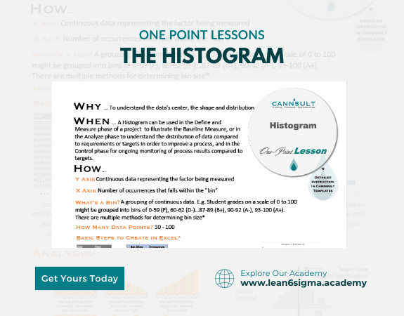
A Histogram is a graphical representation of data that shows the distribution and frequency of values in a dataset, helping identify patterns and insights.
Description:
A Histogram is a valuable tool for visualizing the distribution of data. It divides data into intervals or bins and displays how many data points fall into each bin. This representation makes it easier to understand data patterns and characteristics.
Steps:
Collect Data: Gather the dataset you want to analyze. This data can represent anything from measurements to counts or observations.
Determine the Number of Bins: Decide how many intervals or bins you want to use to group the data. This determines the granularity of the histogram.
Calculate Bin Width: Divide the range of data values by the number of bins to determine the width of each bin.
Create the Histogram: Place the data values on the x-axis (horizontal) and the frequency (number of data points) on the y-axis (vertical). Create the bins by dividing the data range into equal intervals. Count how many data points fall into each bin and represent this count as a bar or column above each bin.
Label Axes: Label the x-axis with the data values or intervals and the y-axis with the frequency or count.
Analyze the Distribution: Examine the histogram to identify patterns in the data, such as modes (peaks), skewness (asymmetry), or the overall shape of the distribution.
Draw Conclusions: Use the histogram to draw conclusions about the data distribution. For example, is it normal, skewed, bimodal, or something else?
Benefits:
Visual representation of data distribution
Identification of data patterns and characteristics
Quick insights into data behavior
Effective communication of data to others
Key Takeaway:
A Histogram is a powerful tool for visualizing and understanding data distributions. By examining the shape and patterns within the histogram, you can gain valuable insights and make data-informed decisions.
0 Reviews
Riaan is a dynamic leader, coach, facilitator, Lean Six Sigma Master Black Belt with over 20 years of hands-on experience driving business results. Riaan is highly skilled and has worked across diverse industries internationally. With a degree in Chemical Engineering, Riaan started in the major breweries and bakeries in South Africa and was so dedicated to his work that he was often known to take his work home with him.