Pareto
80:20 Rule
Focused problem solving
Prioritize issues
Make decisions based on data, not emotion
Just do It!
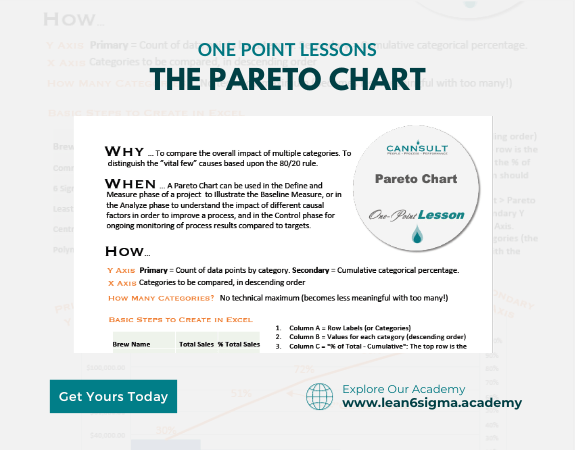
A Pareto Chart is a graphical tool used to prioritize issues or problems by displaying them in descending order of importance, enabling more efficient problem-solving and resource allocation.
Description:
A Pareto Chart is a decision-making tool that helps organizations identify and address the most critical issues or causes contributing to a problem. It's based on the Pareto Principle, which states that roughly 80% of effects come from 20% of causes.
Steps:
Identify the Problem: Clearly define the problem you want to address. It could be quality issues, customer complaints, defects, or any other concern.
Collect Data: Gather data related to the problem, including information about individual occurrences, issues, or contributing factors.
Organize Data: Categorize the data into groups or categories. This step helps group similar issues together.
Count Occurrences: Determine the frequency or count of each issue within the categories.
Calculate the Total: Find the total number of occurrences or issues related to the problem.
Create the Pareto Chart:
List the categories or issues along the x-axis (horizontal) in descending order of frequency.
Place the frequency or count on the y-axis (vertical).
Create bars or columns for each category, with the tallest bars on the left and decreasing in height to the right.
Add a Cumulative Percentage Line:
Draw a cumulative percentage line on the chart to represent the cumulative contribution of each category to the total.
This line helps identify the point at which the most significant issues collectively account for a significant portion of the total.
Analyze and Prioritize: Examine the Pareto Chart to identify the top categories or issues that collectively contribute to the majority of the problem. These are the highest priority areas for improvement.
Implement Solutions: Focus problem-solving efforts and resources on addressing the most critical issues identified by the Pareto Chart.
Benefits:
Prioritization of issues based on significance
Efficient allocation of resources
Focused problem-solving efforts
Improved decision-making
Key Takeaway:
A Pareto Chart is a valuable tool for prioritizing issues or causes based on their significance, allowing organizations to focus their efforts where they will have the greatest impact. By addressing the most critical problems first, organizations can improve efficiency and outcomes.
0 Reviews
Riaan is a dynamic leader, coach, facilitator, Lean Six Sigma Master Black Belt with over 20 years of hands-on experience driving business results. Riaan is highly skilled and has worked across diverse industries internationally. With a degree in Chemical Engineering, Riaan started in the major breweries and bakeries in South Africa and was so dedicated to his work that he was often known to take his work home with him.