The Run Chart Template
Here are the key components typically found in this Run Chart Template:
Time Period: The time intervals at which data points are collected and plotted. This could be daily, weekly, monthly, or any other relevant time unit depending on the nature of the data and the project.
Data Points: A list or series of data points representing the measurements or observations collected at each time interval. These data points are usually plotted on the vertical (Y) axis of the chart.
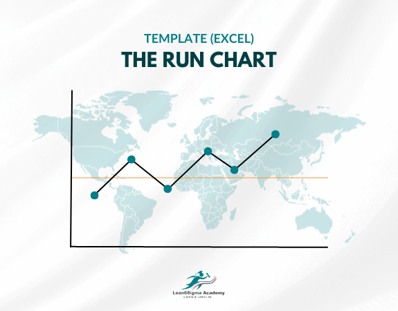
Horizontal (X) Axis: The horizontal axis represents time, with data points plotted chronologically from left to right. It may include labels or markings to indicate specific time intervals.
Center Line: A center line, often drawn as a horizontal line across the chart, represents the average or median value of the data. It helps identify shifts or trends in the data compared to the expected or target value.
Upper and Lower Control Limits (if applicable): In some cases, especially when analyzing process data for quality control purposes, upper and lower control limits are added to the chart. These limits define the acceptable range of variation in the data. Data points falling outside these limits may indicate special causes of variation that require investigation.
Data Point Labels: Depending on the chart's purpose, labels or annotations may be added to data points to provide additional information or context for specific observations.
Title and Labels: The chart typically includes a title that describes the data being plotted and labels for the X and Y axes to provide clarity and context.
A Run Chart is a valuable tool for several reasons:
It provides a visual representation of data trends and patterns over time, making it easier to spot changes or anomalies.
It helps teams and organizations assess the impact of process changes or interventions by comparing data before and after implementation.
It is a useful tool for tracking the performance of processes, products, or services to ensure they meet established standards or targets.
Run charts can be used in various fields, including healthcare, manufacturing, service industries, and more, to monitor and improve processes and outcomes.
When interpreting a Run Chart, it's essential to consider the data points' stability and any discernible patterns or shifts.
If the chart shows a consistent upward or downward trend, or if data points consistently fall outside control limits (in control charts), it may indicate the need for further investigation or process improvement actions.
0 Reviews
Riaan is a dynamic leader, coach, facilitator, Lean Six Sigma Master Black Belt with over 20 years of hands-on experience driving business results. Riaan is highly skilled and has worked across diverse industries internationally. With a degree in Chemical Engineering, Riaan started in the major breweries and bakeries in South Africa and was so dedicated to his work that he was often known to take his work home with him.