The Scatter Plot Template
Identifying patterns or trends in the data.
Detecting outliers or anomalies.
Visualizing the relationship between two variables.
Assessing the strength and direction of correlation.
Comparing data from different groups or categories.
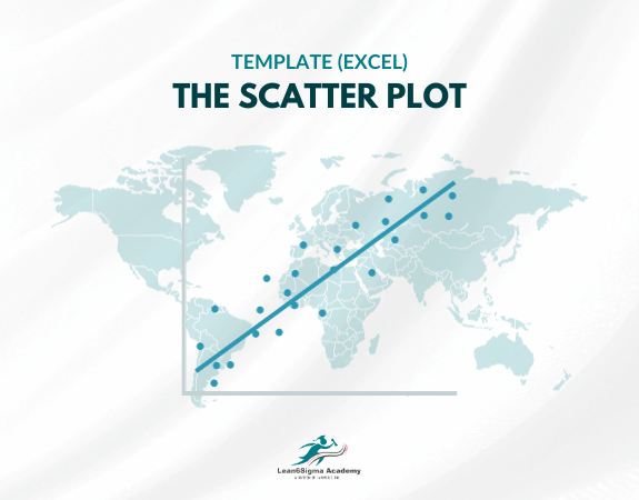
The Scatter Plot Template typically includes the following components:
Title: A title that describes the purpose or context of the scatter plot, providing information about what the data represents.
X-Axis Label: A label for the horizontal (X) axis, indicating the variable or attribute represented on this axis. This label provides context for the data points along the X-axis.
Y-Axis Label: A label for the vertical (Y) axis, indicating the variable or attribute represented on this axis. This label provides context for the data points along the Y-axis.
Data Points: Data points plotted on the graph, with each point representing a pair of values from the two variables being studied. Each data point is typically represented as a dot or marker on the graph.
Data Labels: If necessary, labels or identifiers for specific data points may be included to make it clear which data point corresponds to which data set or category.
Legend: A legend may be added if there are multiple data series or categories represented in the scatter plot. The legend helps distinguish between different groups of data points by assigning colors, shapes, or symbols to each group.
Gridlines: Gridlines may be included to assist with reading the values of data points and understanding the scale of the graph.
Trendline: In some cases, a trendline or regression line may be added to the scatter plot to indicate the general trend or relationship between the two variables. Trendlines can be linear, polynomial, exponential, or based on other mathematical models.
Correlation Coefficient: If applicable, the correlation coefficient, a statistical measure of the strength and direction of the relationship between the variables, may be displayed on the scatter plot.
Scale: The scale or range of values represented on each axis, including the minimum and maximum values, may be indicated to provide context for interpreting the data.
Scatter plots are valuable for several purposes, including:
Visualizing the relationship between two variables.
Identifying patterns or trends in the data.
Assessing the strength and direction of correlation.
Detecting outliers or anomalies.
Comparing data from different groups or categories.
This Scatter Plot Template is created in Microsoft Excel.
They are widely used in fields such as statistics, science, economics, and social sciences to gain insights into data relationships and make informed decisions based on data analysis.
0 Reviews
Riaan is a dynamic leader, coach, facilitator, Lean Six Sigma Master Black Belt with over 20 years of hands-on experience driving business results. Riaan is highly skilled and has worked across diverse industries internationally. With a degree in Chemical Engineering, Riaan started in the major breweries and bakeries in South Africa and was so dedicated to his work that he was often known to take his work home with him.